Information Experience Design
Improving the digital experience for Monterey Bay Aquarium.
Overview
Monterey Bay Aquarium is a nonprofit public aquarium in Monterey, California. The mission of the Aquarium is to inspire conservation of the ocean. It is house of around 35,000 animals of 550 species including jellyfish, sharks, sea otters, penguins, among many others. Monterey Bay Aquarium receives around two million visitors each year, during most part of 2020 it has been closed due to the Covid-19 pandemic.
My team was tasked with assessing pages like the Live Cam pages to maximize user engagement in order to drive more donations.
My Role
UX Researcher
UX Designer
Team Facilitator
Duration of the project
13 weeks (September-December 2020)
Design Process
My team’s process.
Step 1: Understanding our client’s needs and expectations
The first step in our process was to understand our stakeholders and their needs and expectations. In order to do this, we conducted a brainstorming exercise to categorize stakeholders into a power-interest graph to prioritize key stakeholders and their expectations. Following that, we gathered as a team and build an Affinity Map to organize users, users’ goals, motivations, pain point and potential solutions.
Stakeholders power interest graph.
Affinity Map.
After organizing the information we came with a project plan. The document served the purpose of narrowing down the scope of the project as well as being a tool of communication with out clients. In the project plan we drafted the overall objective and specific objectives.Additionally, we drafted two potential personas and scenarios.
Overall Objective
Increase user engagement and improve the overall experience of the website.
Specific Objectives
Improve ease of use and maximize user-engagement with the content on Live Cam Pages.
Make deeper content more discoverable through effective navigation.
Increase user engagement and drive donations from popular areas of the site like Live Cams.
Step 2: Defining the audience
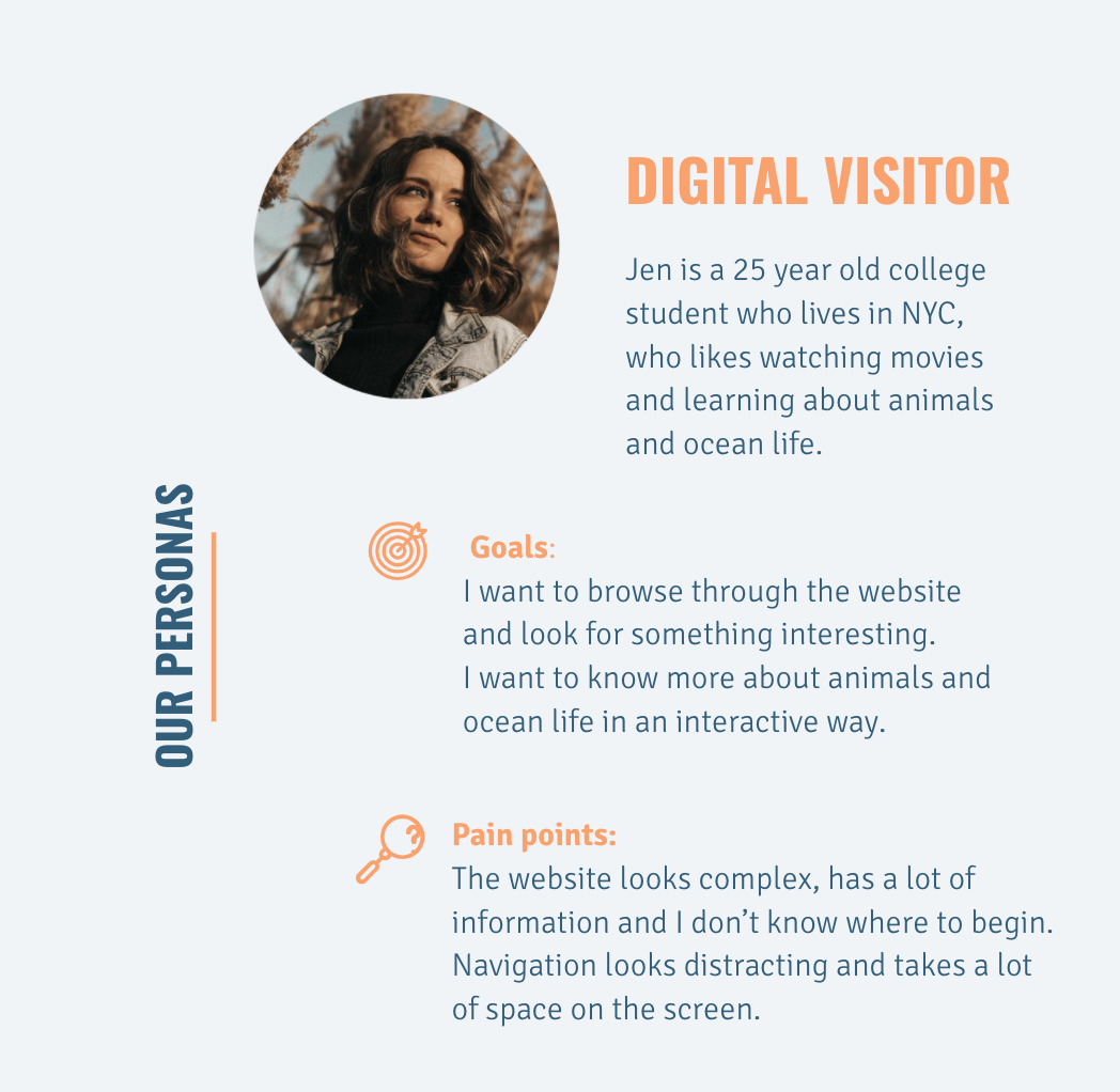
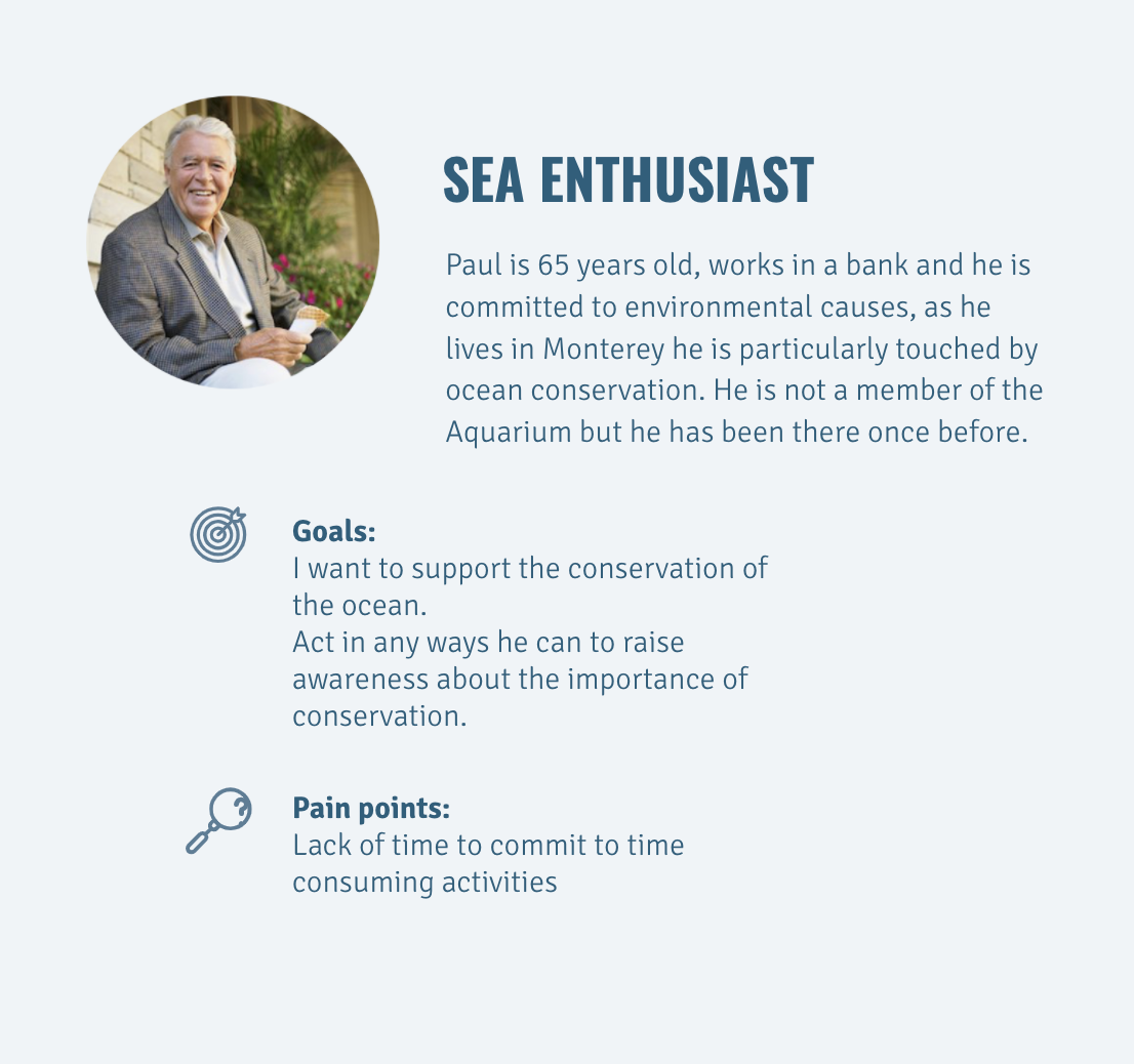
The scope of this phase was to define the audience we wanted to optimize for. The approach to do this was to analyze data from current users using Google Analytics. In that analysis we discovered that younger audiences are the ones visiting the website the most. However, older audiences are the ones donating the most. Based on this insight, and on the information the client provided, we built two personas that would lead the rest of the research and design.
Step 3: Assessing the site map
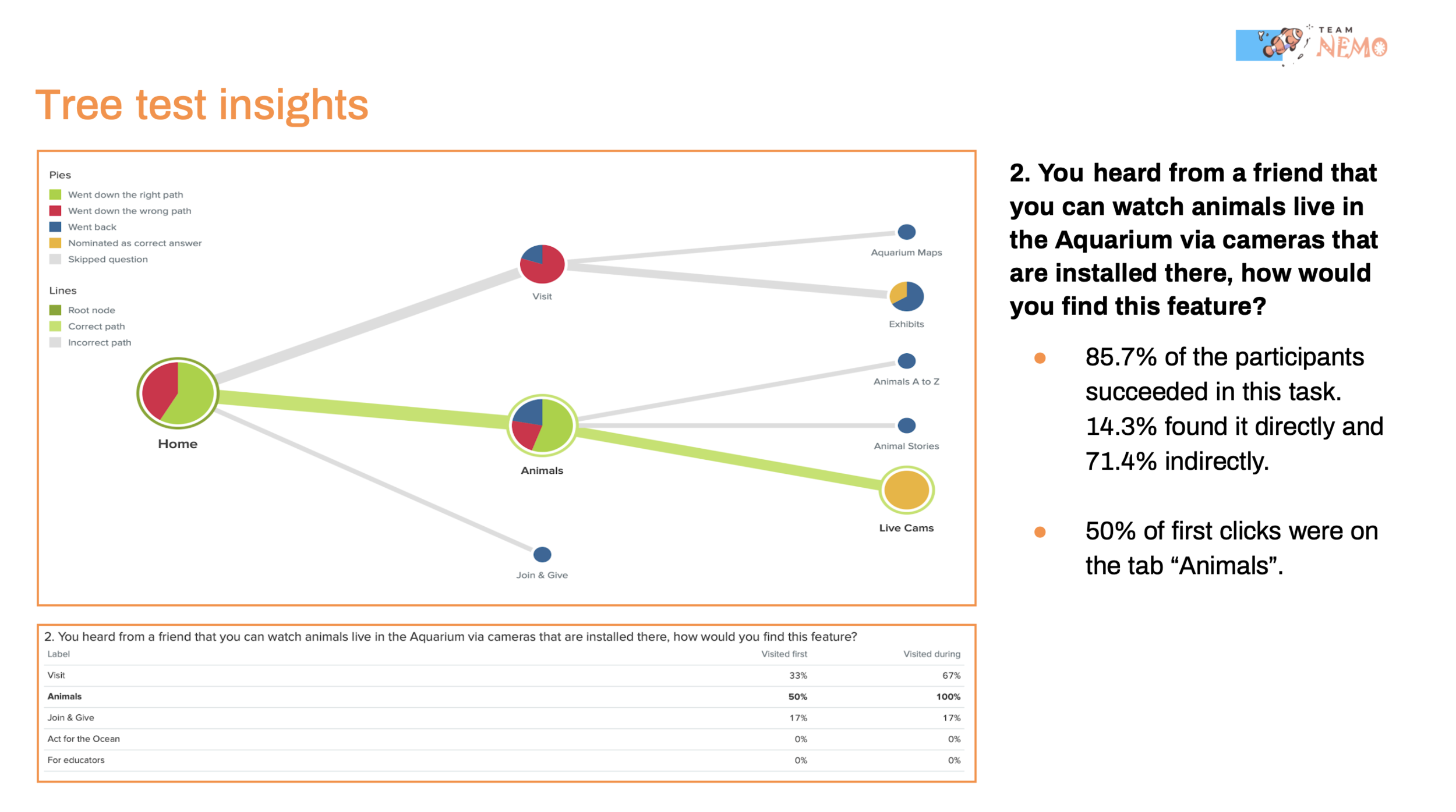
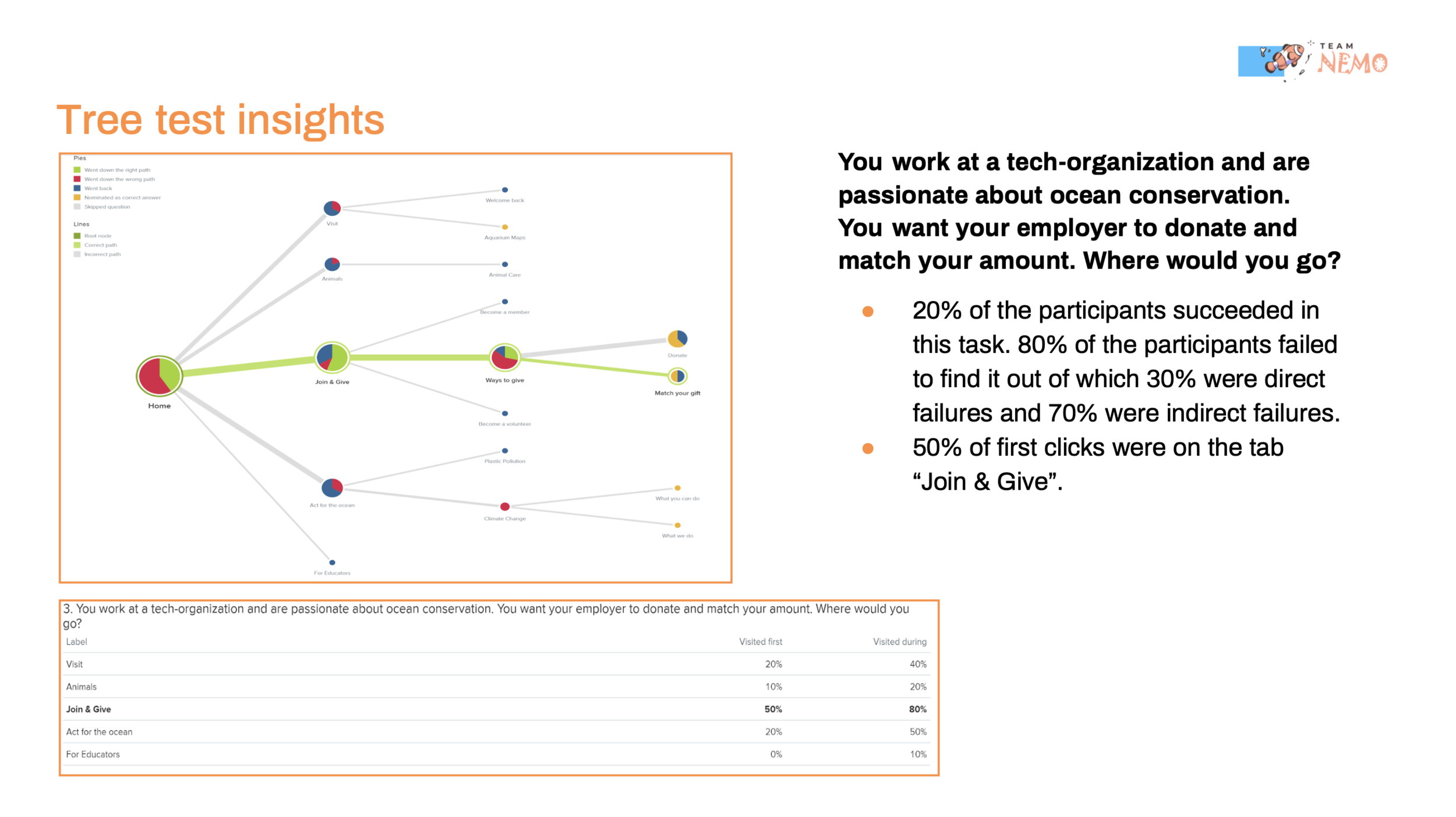
One of our client’s concerns was how to surface deeper information. To evaluate the access to information, we conducted a tree test, which gave us insights about the organization of the information on the site. The test was conducted with 15 participants using Optimal Workshop and the findings it provided served as a base to build our MVP.
The key finding from the tree testing were:
- “Live Cams” are not directly discoverable and only a half of participants find the page directly.
- “Match your gift” as a label is ambiguous and leaves room for confusion.
- Participants do not explore deeper content, like Stories.
Based on these observations and key findings we came up with recommendations :
- Differentiate “Live Cams” from other content in the Animals section by prioritizing in hierarchy with visual adjustments.
- Change “Match your gift” to “Match your donation”.
- Make deeper content more accesible by placing all the information about a particular animal on the same page.
Step 4: Building an MVP
The first three steps gave us enough information to build a Minimum Viable Product (MVP). Our MVP consisted in improvements in the areas of accessibility to Live Cam pages and donation process and it would serve as a base to conduct usability testings to test our recommendations. The MVP also served as a tool to communicate with our client and discuss the priorities for the second phase of the project.
Step 5: Remote Moderated Usability Testing
The next step in our process was to conduct usability testings with the goal of testing if our proposed solutions were solving the problems we spotted. We took the opportunity to test both, the live site of the Monterey Bay Aquarium and also our prototype with the recommendations we drafted.
We conducted Remote Moderated User Tests with 9 participants, that fitted the two personas we are optimizing for. Through this process we confirmed some of our hypotheses and gathered new insights.
Before describing the findings and recommendations I will briefly describe how we conducted the User Tests and the Tasks we asked the participants to perform.
Tasks
Seven brief tasks were prepared to assess the usability of the Aquarium's website as well as our prototype. Half of the participants started the test with the live site and half of them started the test with the prototype, in order to avoid biased results. The tasks aimed to test the home page, the Live Cam page as well as the navigation within this page and finally the donation process.
Goal: Explore the ability to navigate to the live cam pages
You want to watch the streaming of the animals that are living in the Aquarium. How would you do that?
Goal: Evaluate overall experience of Live Cam Page
You are a sea animal enthusiast, you wish to look at different ocean animals on the website. Can you please find the Shark cam?
You want to look up more content about sharks. Where would you go?
You want to look up a story about sharks. Where would you find it?
You want to watch the streaming of Sea Otters now. Where would you go?
Goal: Evaluate how people use donation form and what drive people to donate on popular pages
Let’s say you want to donate, how would you do that?
Please complete the donation process.
Step 6: High Fidelity Prototype
After conducting the Usability Tests we organized our findings in a detailed Problem List in which we categorized and prioritized the issues found by our participants. This document served us as a guide to design solutions. The way to present the solutions to our stakeholder was through a high fidelity prototype built in Figma. Below I provide an explanation of the findings and recommendations included in our high fidelity prototype.
Recommendation #1: Add Live Cam Link to top navigation panel to increase discoverability of the page
Live Cam pages are the most popular content of the Monterey Bay Aquarium. However, it is hidden in the navigation. In the Tree Test only 50% of participants could find it directly.
“It's kind of hard to find Live Camera, it should be easy to find. I like this feature and I think lot of people will like this feature too.”
— Participant #3
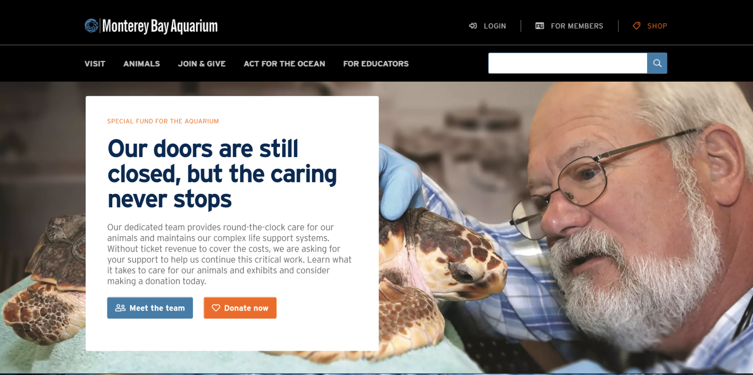
Before
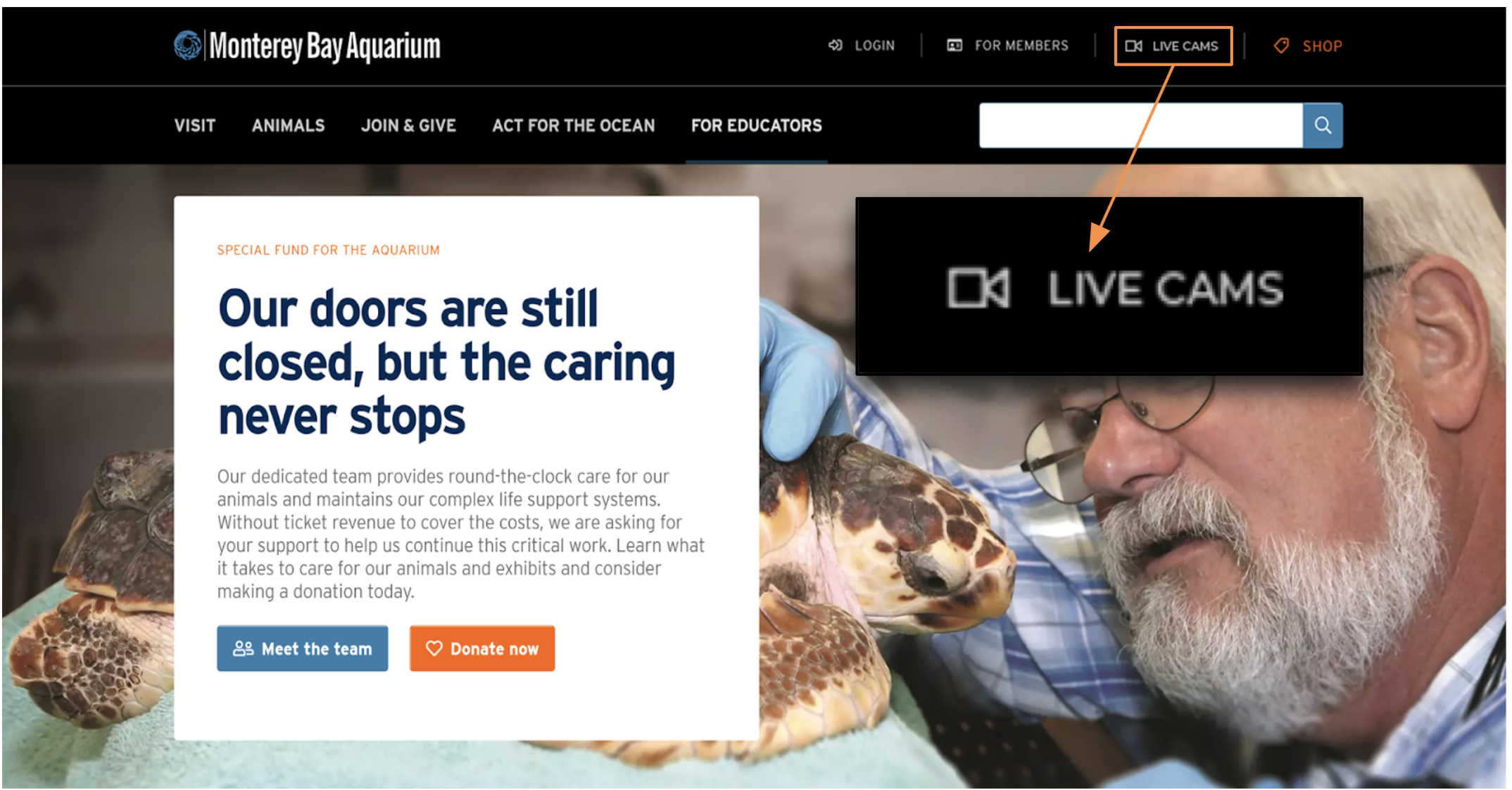
After
Recommendation #2: Improve overall user experience on Live Cam pages by displaying all the content on the same page
Participants found the Live Cam main page not very engaging at first sight. Some of them complaint about the amount of text in the page and the lack of clarity of the information. To improve the engagement with this page we recommend making the content more accesible in the first fold on the page. During the user testing participants liked to see the expected content of this page upfront, in other words they liked the fact that they could see the video right away and could easily switch betweeen different videos.
Before
After
Recommendation #3: Simplify the donation process
The current donation process is lenghty, which might make users lose interest midway through the donation process. In order to enhance overall donation process, we propose a redesign of the donation experience. The new design allows users to stay on the current page and complete donation process without jumping anywhere else. They can complete donation amount, donor information and payment in one box on the webpage.
Recommendation #4: Add a donation prompt to the Live Cam pages and reduce the predetermined donation amounts
Live Cam pages are the most visited pages in the website. This is a great opportunity to drive donations from visitors. According to our test results, the predetermined donation amounts are too high for users. The suggested amount intimidates first time users including younger people and students. That is why we suggest changing the donation amounts to less intimidation amounts. During the user testing, participants mentioned that they would feel more invited to donate if they saw lower amounts. Besides the feedback from user testing participants, literature shows that lower donation amounts increase the donation rate. Also, best practices in the field suggest that having donation levels that goes according to the average donation amount, increase donations.
Step 7: Client Presentation
The last step in our process was the client presentation. During the presentation we went over the entire process step by step to get to our final deliverable: our high fidelity prototype. We got positive feedback from our clients and we could see some of our recommendations implemented in their website a couple of weeks later.


